As I reflected on how I want to show up in 2026, the answer arrived quickly: more deeply me. I wanted to bring forward the color that reflects who I am and the warmth that has always shaped how I lead, create, and connect. For several years, alignment has been my guiding word. In 2026, evolution resonates more strongly, yet alignment still quietly lingers in the background.
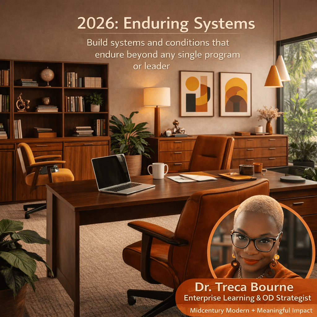
That steady whisper guided what I chose to represent me. I selected the recent photo that now appears on my LinkedIn and committed to a midcentury modern design aesthetic. I was drawn to its endurance, clarity, and accessibility. Historically, it was created to be lived with rather than admired from afar, and that accessibility mirrors how I approach learning, leadership, and organizational work. It also supports my 2026 mantra, which is to build systems and conditions that endure beyond any single program or leader.
The way this all came together reads like a straight line now, although in reality it was more of a quiet unfolding. It began with an insight that surfaced on Christmas Day and continued to take shape as the day moved forward.
After experimenting, refining, and asking ChatGPT to generate an image to support my brand refresh on LinkedIn and now here, something clicked. It feels right. It feels warm. It feels aligned. And as someone noted, it is stylish. I agree. 2026 deserves more style than we gave 2025.
